
Card
Rounded content cards to showcase projects, event photos and new programmes. surface is the default 16px-radius card; raised is the bordered, warm-shadowed card from the brand page; image puts text over a darkened photo. Set href to make the whole card a link.
Surface
The everyday card, on the surface color.
Raised
Bordered, with a soft warm shadow.
Image
Text over a photo. This one is a link.
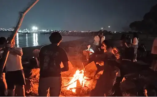
With media
Media slot, lifts on hover.
<div class="grid">
  <hc-card>
    <h3 class="card-title">Surface</h3>
    <p class="card-text">The everyday card, on the surface color.</p>
  </hc-card>
  <hc-card variant="raised">
    <h3 class="card-title">Raised</h3>
    <p class="card-text">Bordered, with a soft warm shadow.</p>
  </hc-card>
  <hc-card variant="image" image="https://hackclub.com/assets/hero_photo2.webp" href="https://game.hackclub.com">
    <h3 class="card-title">Image</h3>
    <p>Text over a photo. This one is a link.</p>
  </hc-card>
  <hc-card variant="outline" interactive>
    <img slot="media" src="https://hackclub.com/assets/hero_photo3.webp" alt="" height="160" />
    <h3 class="card-title">With media</h3>
    <p class="card-text">Media slot, lifts on hover.</p>
    <hc-button slot="footer" size="sm" variant="secondary">Open</hc-button>
  </hc-card>
</div>
API
Attributes
| Name | Type | Default | Description |
|---|---|---|---|
variant | "surface" | "raised" | "outline" | "image" | "ink" | "surface" | Visual style |
href, target | string | Make the whole card a link | |
image | string | Background image for the image variant | |
interactive | boolean | false | Lift on hover (automatic with href) |
Slots
| Name | Description |
|---|---|
(default) | Body |
media | Full-bleed content above the body |
footer | Pinned to the bottom |
CSS parts
| Name | Description |
|---|---|
card | The card |
body | Padded body |
footer | Footer wrapper |
CSS custom properties
| Name | Description |
|---|---|
--hc-card-padding | Body padding |